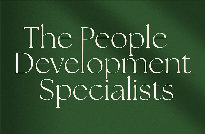
From Strengths-Based Leadership to Strategic Brand Clarity: The Refresh Behind People Development Specialists
There’s a particular kind of confidence that doesn’t need to shout.
It feels calm, grounded, thoughtful, and clear. The kind of presence that immediately puts people at ease. That was exactly the feeling Helen wanted her brand to communicate through the refresh of People Development Specialists.
Helen’s work centres around helping individuals and teams communicate better, lead with confidence, and connect more meaningfully through strengths-based development. Her approach is deeply human, strategic, and relationship-led, but her existing brand and website no longer reflected the calibre or direction of the business she had built.
The challenge wasn’t to reinvent the business.
It was to create alignment between Helen’s work, personality, and visual identity.
The Challenge
Like many growing service-based businesses, Helen had evolved significantly since her original branding was created.
Her previous identity felt dated and no longer reflected the sophistication of her work, the warmth of her approach, or the confidence and professionalism of the business today.
The website also needed a complete refresh to better support her positioning, communicate her services more clearly, and create a more seamless experience for prospective clients.
Most importantly, the brand needed to feel like Helen.
Professional — but never corporate.
Sophisticated — but still approachable.
Strategic — while remaining deeply human.
Creating a Brand That Felt Calm, Clear, and Confident
From the outset, the goal was to build a brand identity grounded in connection, clarity, and forward momentum.
We developed a refreshed visual direction centred around a vibrant yet grounded colour palette that reflected Helen’s warmth, energy, and thoughtful leadership style while still feeling refined and timeless. The visual identity intentionally moved away from traditional corporate coaching aesthetics and instead leaned into softness, sophistication, and authenticity.
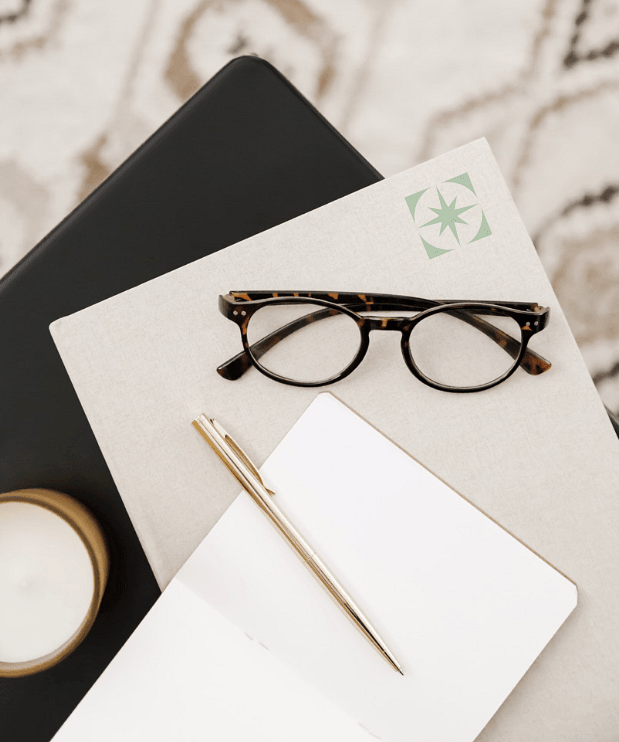
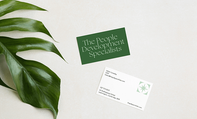
An important part of the identity system was the North Star symbol.
The North Star represents clarity and direction, while the enclosing circle symbolises connection, together creating a shared point of reference that aligns people and ideas while supporting confident forward momentum.
That symbolism became a meaningful strategic thread throughout the project because it reflected the exact experience Helen creates for her clients.
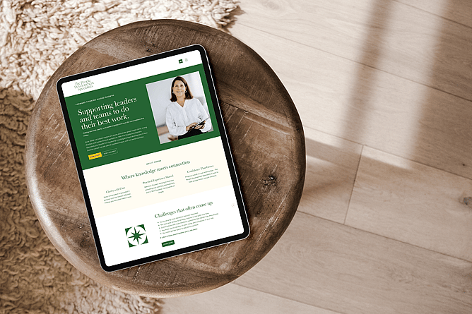
Bringing the Brand to Life Online
Alongside the rebrand, we designed and developed a completely refreshed website that better reflected the quality and depth of Helen’s work.
The new site was designed to feel calm, intuitive, and strategically structured, while still maintaining warmth and personality throughout. Clear messaging, thoughtful pacing, and intentional visual hierarchy helped create an experience that mirrors Helen’s coaching style: grounded, insightful, and approachable.
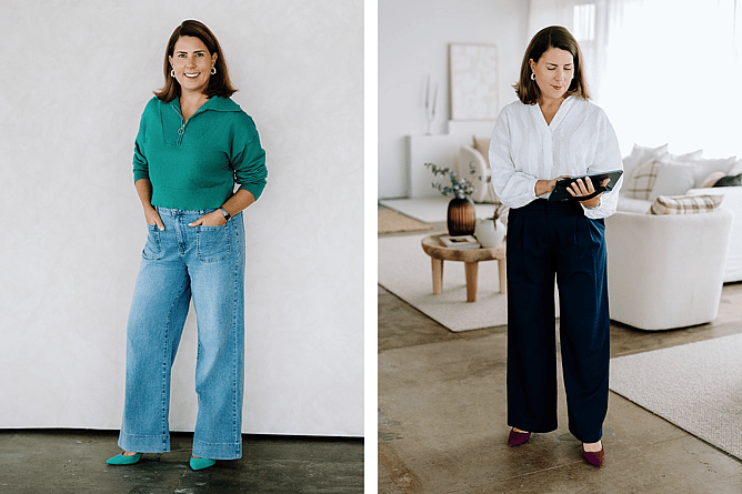
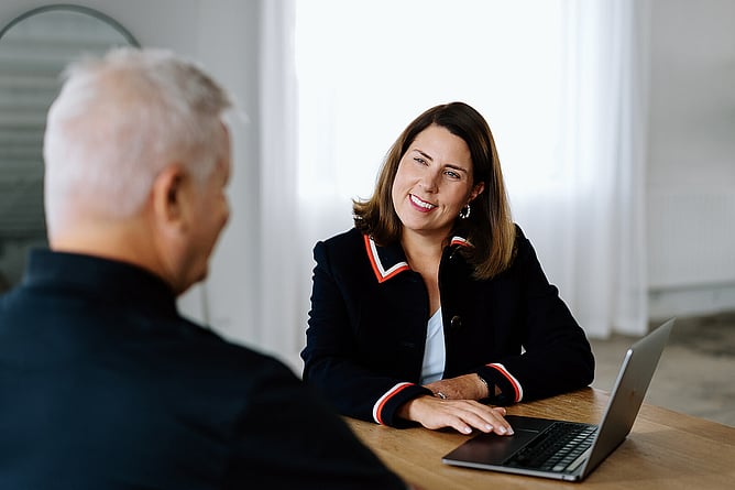
Professional photography by Holly Fulforth Photography also played an important role in bringing authenticity and personality into the brand experience.
The final result is a website that not only communicates Helen’s services more clearly, but also builds trust from the very first interaction.
You can view the finished website here: www.thepdspecialists.com
A Collaborative Process
One of the things we value most at The Little Acre is creating a process that feels collaborative, supportive, and clear, especially for clients who may not live in the design world every day.
Helen shared this in her testimonial:
“The process, the options, and the decisions were all communicated in straightforward language, which made the whole experience feel calm and manageable rather than technical or overwhelming.”
She also reflected on the importance of collaboration throughout the project:
“It genuinely felt like a partnership. We were closely involved in shaping the outcome, but always under Liora’s creative guidance and supported by her extensive experience, design instinct, and technical expertise.”
For us, that balance matters.
Good design isn’t just about creating something visually beautiful. It’s about creating alignment, clarity, and confidence while making clients feel supported throughout the process.
The Outcome
The refreshed People Development Specialists brand now feels deeply aligned with the business Helen has built and where it’s heading next.
The new identity and website communicate professionalism without corporate stiffness, warmth without losing credibility, and clarity without complexity. Most importantly, the brand now reflects the experience clients have when working with Helen: thoughtful, grounded, strategic, and genuinely human.
Projects like this are exactly why we love what we do.
Not simply because we get to design beautiful brands and websites, but because thoughtful design has the ability to help good businesses show up with greater clarity, confidence, and connection.
And when that alignment happens, everything else starts to flow more naturally.