From friendly to formidable — the Little Buddies rebrand
When a client outgrows their brand, the brief writes itself.
Little Buddies came to us at an interesting moment. Marty Pine had built something real — a composting and vermiculture operation in Cambridge that had started with local food waste collection and grown, quietly but steadily, into something much more significant. He was advising large organisations on waste strategy. He was navigating council consent processes for major operations. He was sitting across the table from sustainability directors and COOs talking about systems, investment, and corporate responsibility.
And he was doing all of that with a brand that had been built for a completely different version of the business.
The old brand wasn't wrong — it was just early. Warm colours, a rounded approachable font, the visual language of a local environmental service. It said we care about the planet in a way that resonated with the Cambridge community at the time. But it didn't say we are the people you call when you have a serious organic waste problem and you need it solved properly. That's the conversation Marty was now having. The brand needed to catch up.
The brief
The name stays. Little Buddies has traction, word of mouth, and — critically — a pattern interrupt that works in Marty's favour. Introducing yourself as being in worm farming in a room full of sustainability consultants gets you remembered. The name is disarming. The work does the rest.
Everything else was on the table.
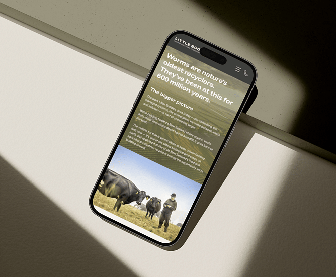
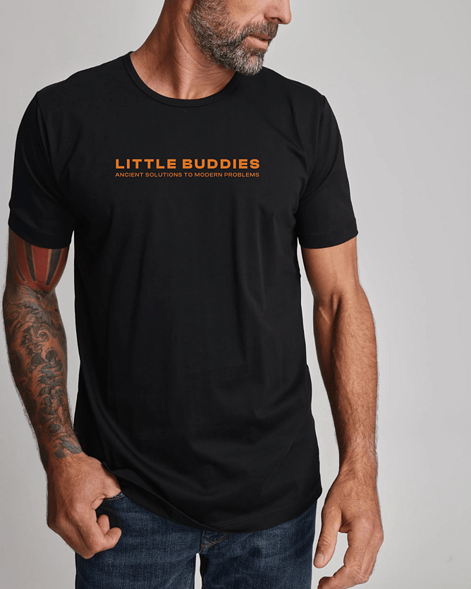
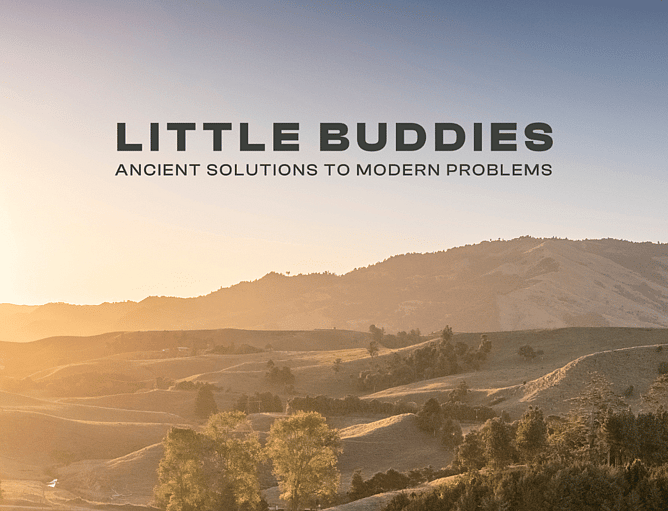
The positioning we landed on after a day of strategy was Ancient solutions to modern problems — a tagline that captures the core truth of the business. Composting and vermiculture aren't new ideas. They're ancient biological processes being applied with strategic sophistication to a very modern problem. The plural matters: two distinct disciplines, one clear purpose.
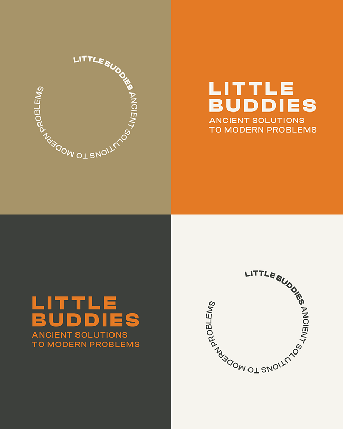
The typography
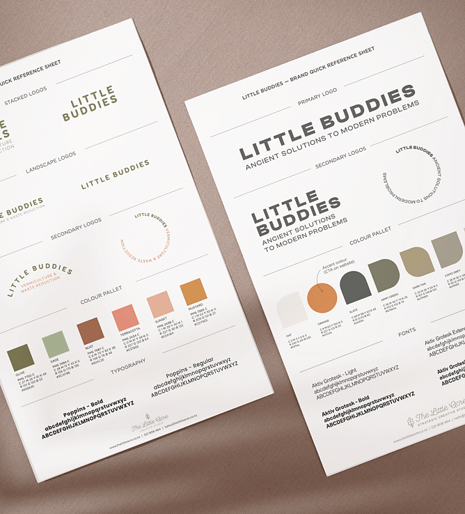
The old brand used Poppins — a rounded, geometric font that reads as warm and approachable. Perfect for a consumer-facing brand that wants to feel friendly and accessible. Not right for a business walking into boardrooms and talking about large-scale infrastructure, council consent, and investor obligations.
We moved to Aktiv Grotesk — condensed, structured, utilitarian. It's the typographic equivalent of a firm handshake. It has authority without being cold, and confidence without being corporate. Set in all caps for the logo, it gives Little Buddies a presence that holds its own in any context — from a business card handed to a CEO to a site sign on a commercial composting operation.
The colours
The old palette leaned warm and artisan — terracottas, rusts, mustards, sage. Beautiful colours that spoke to the environmental and craft side of the brand. But they read more boutique than industrial, more lifestyle than operational.
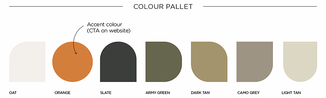
The new palette is built from the land itself — specifically, the land as it actually looks when you're working in it rather than photographing it for Instagram.
Slate is the dark, rich colour of deep soil. Army green is the complex, dusty green of working farmland in late summer — not the bright optimistic green of an eco brand, but the real thing. Oat and light tan are the pale tones of dry earth and raw grain. Dark tan is turned soil, composted and brought back to life. Camo grey is the weathered, practical tone of real working infrastructure.
And then there's the orange. In any working environment — on a farm, at a processing site, around livestock — orange means pay attention. It carries the language of safety: safety of people, of animals, of the land. It's also the single accent that cuts through an otherwise deeply grounded palette, which makes it the natural choice for every call to action on the website. Orange says this is where something happens.
The result
A brand that reflects where Little Buddies actually is — not where it started. The warmth and approachability are still there, held now by the name, the story, and Marty himself rather than by soft fonts and gentle colours. The visual identity does the job of signalling credibility before a word is spoken.
When Marty walks into a room and says he's in worm farming, the new brand is what they find when they Google him afterwards. It holds up.
The Little Acre is a strategic creative studio based in New Zealand. We work with businesses at pivotal moments — when the brand needs to catch up with the business. If that sounds familiar, get in touch.