Bruce came to us wanting a refreshed brand that stayed true to his long-standing reputation in the thoroughbred industry. With the addition of Bruce Perry Consultancy, he needed a clear, cohesive identity that could represent both sides of the business without losing the classic, timeless feel his clients recognise.
The Challenge
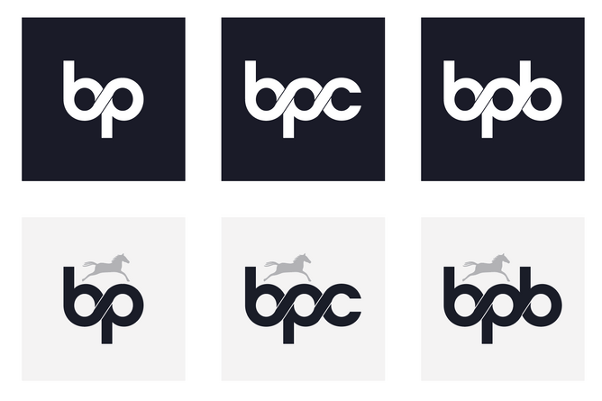
Modernise the existing logo while keeping the original colour palette
Create a brand system that works across:
Bruce Perry Bloodstock
Bruce Perry Consultancy
The combined brand
Build a website that clearly explains the two services and supports future growth
Our Approach
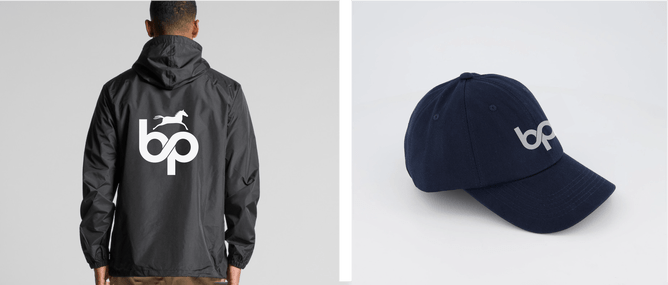
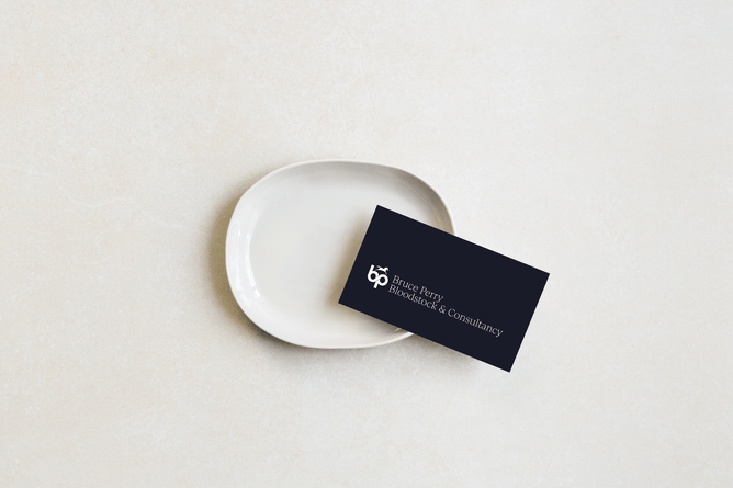
We took Bruce’s original logo and gave it a cleaner, more contemporary look — refining the details while preserving its familiarity. This allowed us to honour the brand’s history while creating a visual identity that feels more elevated and enduring.
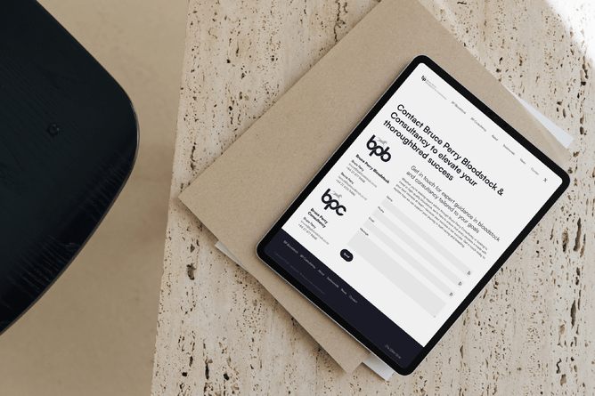
From there, we designed a new website that presents both business arms clearly and professionally. The structure is simple, tidy, and easy to navigate, helping clients understand the full scope of Bruce’s work at a glance.
The Outcome
Bruce now has a recognisable, refined brand supported by a strong, modern website. The refreshed identity gives him the clarity and consistency he needs as the business continues to grow.
If you’re looking to update your brand or bring everything under one clear identity, we’re always happy to chat through options.